Skyline Airlines: End to End Responsive Design
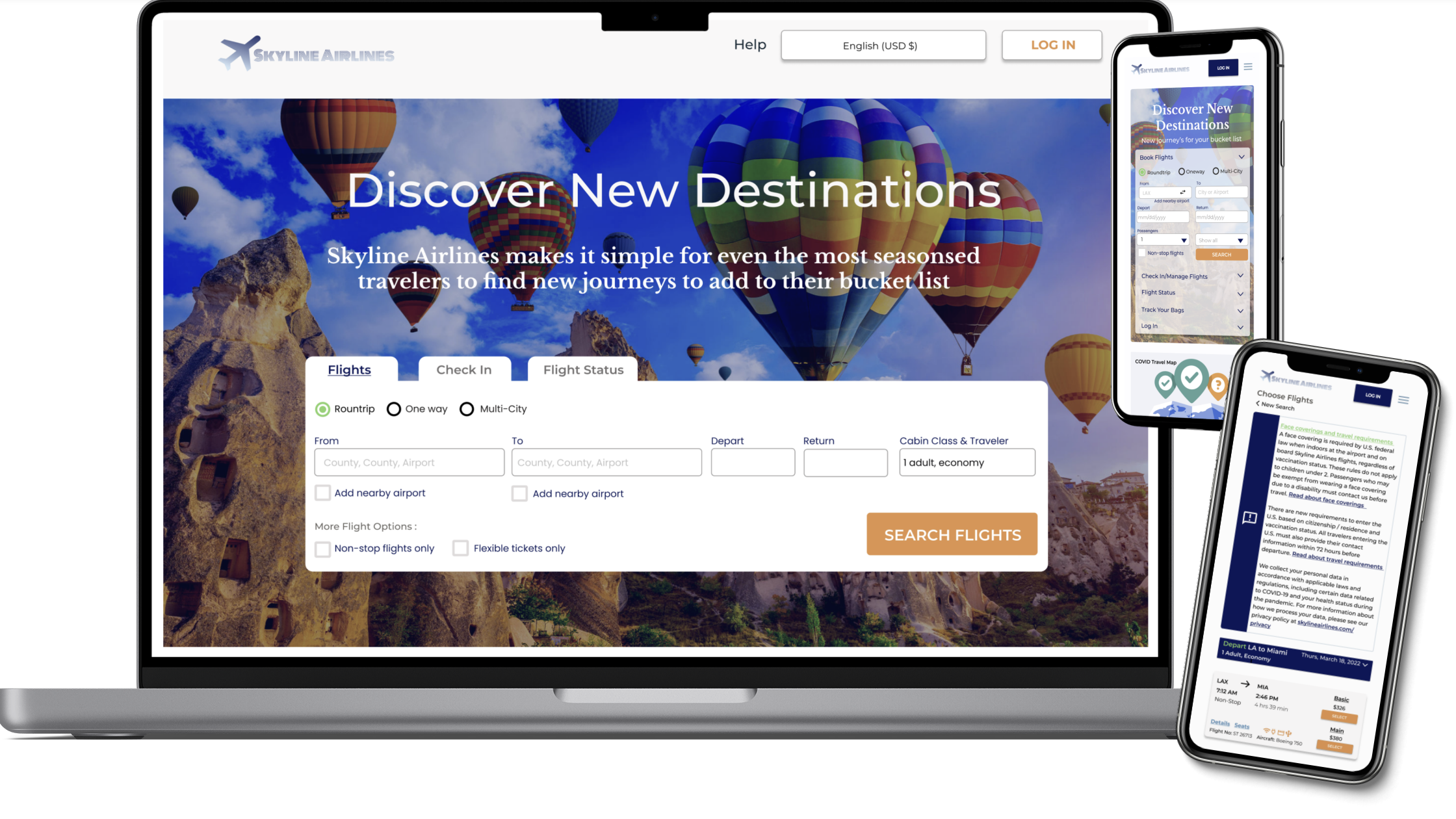
Airline travel sites that allows individuals to search, book and complete travel itineraries easy and efficiently.
Role: UX/UI Designer & Researcher (Solo)
Tools: Pen, Paper, Figma, Miro, Whimsical
Duration: 2 Weeks
Project Overview:
Skyline Airlines is an airline company looking for responsive designs for travel searches, bookings and other important features a traveler would find useful and necessary when booking travel. More than half of travel bookings are done online. New in the travel space, the travel company wants to focus on the responsive project that has the minimum features in terms of what users would expect from a travel provider.
Solution:
Create a fully responsive site for desktop with all of the desired features including a online check in and flight status options.
Discover:
Comparative and competitive analysis
My first goal was to determine my research objectives. I wanted to find out, what sites accomplish travel goals the best, how shoppers currently book travel, what aspects of the websites are favorites and if there are any obstacles that arise in the booking process. Once this was solidified I conducted a competitive analysis of comparable websites (desktop and mobile), this gave me a visual of what current travel sites are offering to their users and look into best current airline practices.
User Interview
I conducted user interviews with 3 individuals to determine how they are using their favorite travel sites (web and mobile), what role travel sites play in their lives and the biggest difference they’ve found between airline services. These interviews were conducted virtually and in person. I was able to gain more insight into people’s favorite travel sites, their why’s, pain points and motivations to continue booking through that platform. I used this information to accurately develop a persona.
User Interview Questions
1) What role does this service play in people’s lives?
2) What role do other travel sites play in their lives?
3) What’s the difference between our airline service and another?
4) Why do some people use the service but not download the app?
General insights:
People liked sites that were easy to use
Sites that show COVID-19 maps. Since March 2020, the world has been stricken with a pandemic causing fear and strict travel restrictions. This map is a easy guide to the what and when traveling by air.
Easy process, minimal pages to click through
Travel sites that are well labeled and show cost of additional fees such as baggage, food and beverage etc.
Some frustrations included technical issues, having to find credit card for checkout, item only available in store.
Define:
After the user interviews, I used the information to create a persona, generate user goals and user motivations that would most fit the target audience of the travel. Meet Trevor Lili, a college student who is enthusiastic to travel to Miami with his friends for Spring Break yet slightly nervous about flying for the first time and booking travel. He’s very organized and follows directions well he just wants to make sure he secures the correct itinerary without any hidden fees or agendas.
I defined what the ultimate user goals and motivations were for Trevor and other potential travelers determine the best way to go about organizing the site to ensure all future users needs were satisfied. The goal was to create a site that a beginner or well seasoned traveler would enjoy.
User Goals:
Successful book the correct itinerary
All additional pricing and fees clearly labeled.
Accounts that save traveler and credit card information.
Highlight flight deals and other interesting information on new destinations.
Motivations:
Saves time
Encourages more travel
Retain loyal customers and travelers
Empathy Mapping
Traveling by plane for the first time can be scary so I wanted to be sure the empath map was a reflection of that. I used the empath map to ensure I was building the best possible product for Trevor (a beginner traveler) to navigate.
Ideate:
User Flow
I generated a user flow for Trevor who is interested in booking a non stop flight from LAX to MIA for spring break. Since Trevor is a first time traveler I wanted to create a number of different flows and made sure the homepage includes a tab in which you get specify non-stop flights only. I wanted to make the pathways as simple as possible. Traveling and booking flights can be scary with all the dates, times and airport codes.
Wireframes
Throughout this project, I wanted to keep in mind that Trevor was a first time airplane traveler. It was highly important that the design be user friendly and well labeled. I created mid fidelity using my favorite features of travelers sites and features necessary for a responsive user experience . The goal was to make Skyline Airline as comprehensive with minimal drop downs and screens.
UI Kit
I wanted to the look and feel of the site to be travel, but I also wanted something fun and aesthetically pleasing. I went for a deep blue with some orange contrast for a clean, professional look.
Prototype & Test:
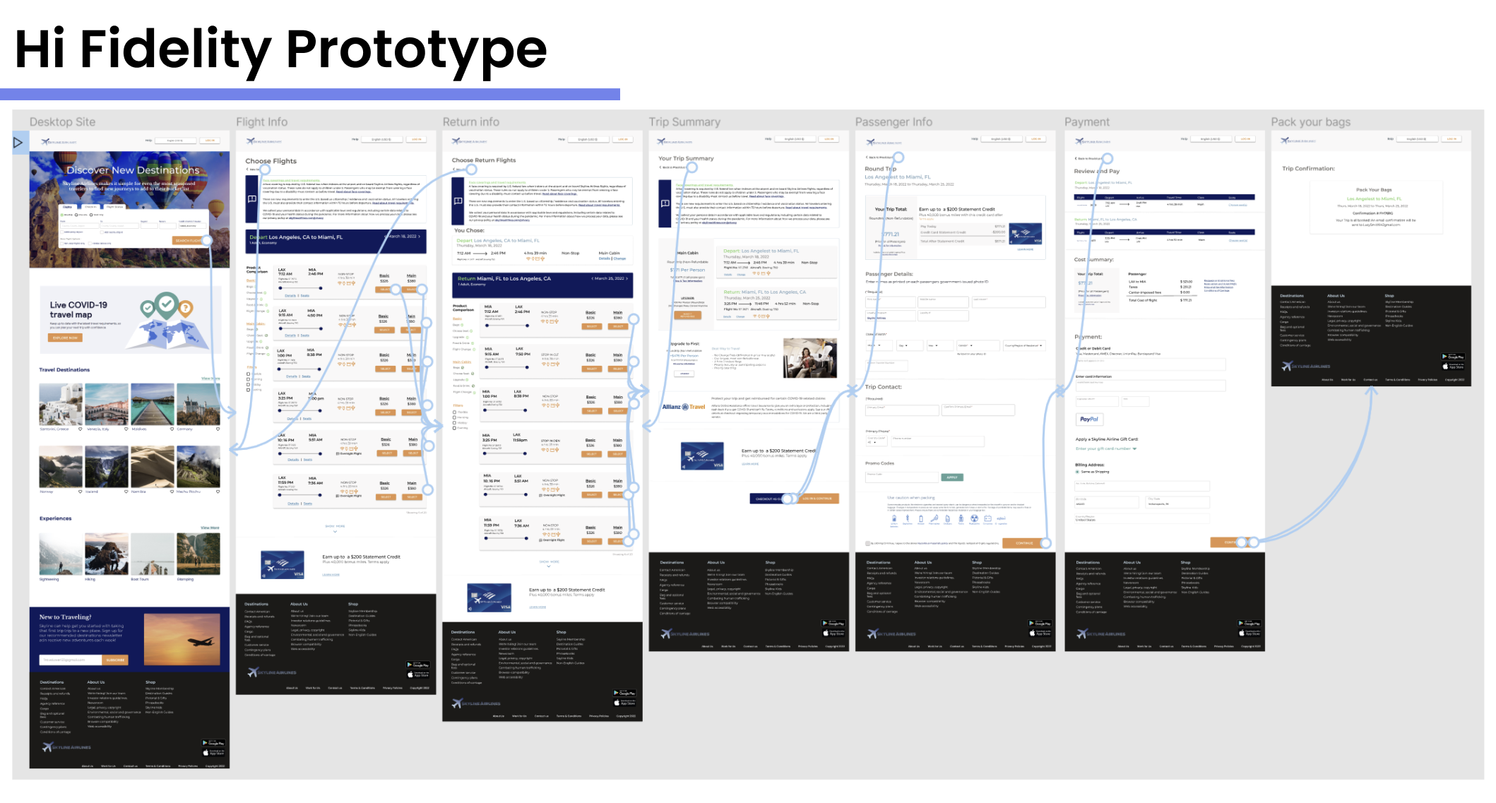
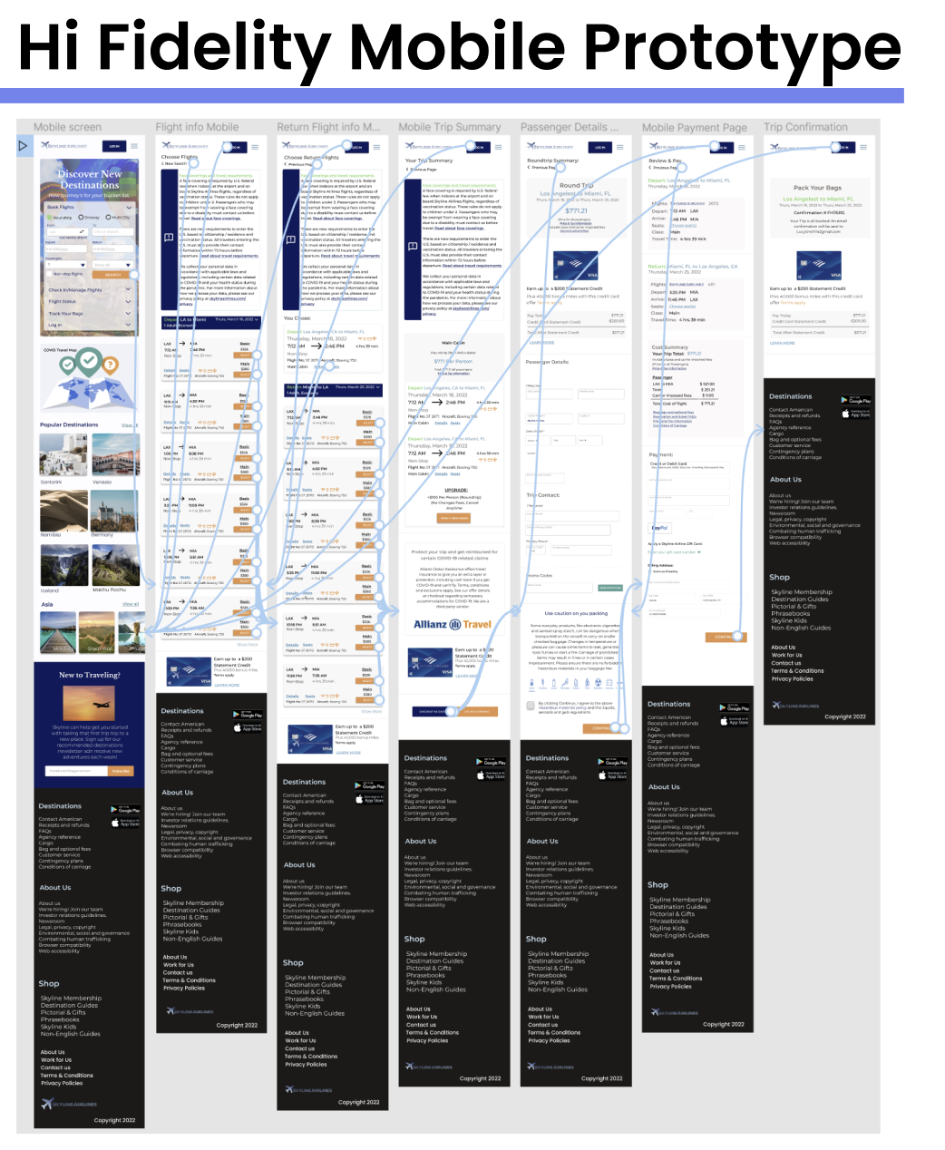
Hi Fidelity Design
As I was creating the Hi-Fidelity designs, I kept the same layout that was created in the mid-fidelity designs. I wanted the design to be clean, but fun and informative. The scenario I wanted to test was have our user book a round trip flight from LAX to MIA, if they wanted to specific a non-stop flight from the initial homepage search that was an option as well.
Test
I conducted the usability testing using three participants. I observed the user flow of each participant i follow the task of booking a round trip flight.
100% of participants were able to successful book travel from start to finish with no error.
Iterations
There were no iterations needed based on the 100% success rate.
Reflections:
The goal for this project was to create a responsive, functional and aesthetically pleasing design that a beginning or seasoned traveler would love. I incorporated all of the interviewees favorite components as best as I could on the Skyline Airline site to create an easy but informative experience.
This project taught me the importance of organization and consistency particularly in Figma. I thoroughly enjoyed this project, creating an aesthetically pleasing and functional design.
Next Steps: The next steps would be to hand off the design specs to the development team to help launch the product.


